Back
Some Crimes Explained
- Tips on how to stay within the law
Text which overlaps images and whitespace
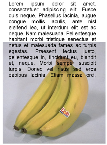
In this example the offender has run text from whitespace right over the top of an image.
This means the reader of the document will find the document more difficult to read.
There are a few solutions to this.
First move the text off the image and leave some whitespace so the image is not "cramped".
Secondly if space is tight and the image is important, but not vital you can put the text over it. Then use a semi transparent background layer behind the text, this makes writing over an image legal.
Although this can still look messy if it is not done well.
Use of three or more fonts in a publication
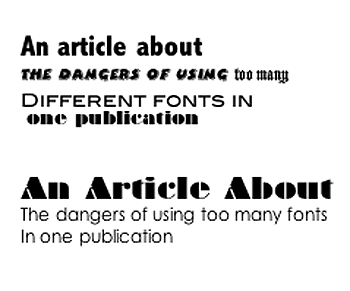
In the text on the right in both cases the same text is used at 20 point for the title and 12 point for the content.
In the example at the top the offender has used four different fonts and the meaning of the title is lost.
In the bottom example the title is in a flashy "display" font and the text below "the body" is in a simple font. This time no crime is committed.
This is the best way to make your work clear and legal.
You could use a third font for subtitles if you wish.
Text in which words wrap between two lines creating "orphans"
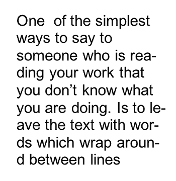
In the piece of text on the right a serious crime has been committed. Words wrap between lines and meaning is lost.
Pieces of text that wrap between two lines or words left at the end of paragraphs are called hyphenated text
In some pieces of software the text will automatically end up like this because of settings in the software. You can turn these settings off in Serif Page Plus and Word does not usually do it. It normally needs you though to sort out lines that are only one word long these are called orphans. The last line of a paragraph going onto a new page also looks poor.

A truly serious crime has been committed here. Both Clipart and Wordart have been used. The simplest way to avoid committing crimes in this case is to avoid using both. There are occasions were clip art might be suitable but they are mainly concerned with publications for young children.
Word art on the other hand is almost always going to be a serious offence, avoid. It is usually better to either make a logo or edit an image. I suppose clipart is convenient and quick but good design takes a long time
Using Comic Sans
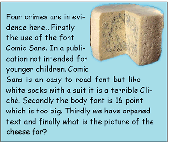
Explanation
It is one of graphic designs great faux pas
to use the font Comic Sans in a publication you want to be taken seriously.
Despite this
we
regularly get all sorts of leaflets and publications from companies
and organisations that should know better.
Give yourself instant credibility
by not using it.
There is even a campaign to
ban it.
Again in this text there is hyphenation and this is a crime.
Using the font Chiller in a serious publication
- Infact the whole idea of appropriate fonts
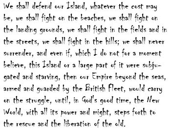
On the right is arguably one of the best examples of public speaking ever deliverd It is Winston Churchill's Second World War "fight them on the beaches" speech. The offender has chosen the wholly innapropriate font Chiller for this text.
The serious impact of this speech is destroyed and the text is hard to
read.
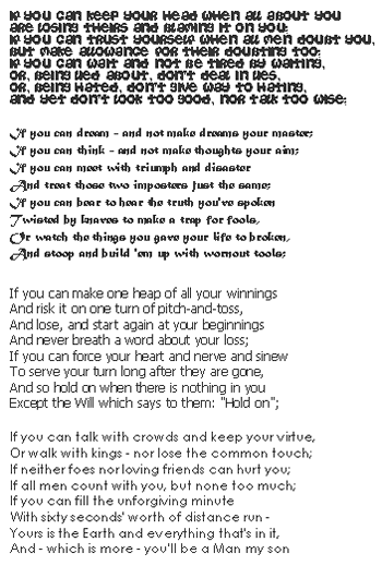
Here is another example of how the font used in a publication can affect how text feels.
This is the poem "If" by Rudyard Kipling."The poem is supposed to be a parent giving advice to their son about what qualities are needed to live a good life and to become a "man".
The poem is fairly serious in tone and quite old fashioned in many ways.
In the first verse the font is casual. This is as non serious a font as it is possible to imagine the text looks cartoon like and the impact of the poem is lost.
In the second verse the poem is set in Matura MT Script Capitals which
gives it a more serious and vaguely oriental feel. It looks
like it belongs on a Pirates of the Carribean advert.
The last two verses are set in Tahoma and Century Gothic respectively.
Both look serious and easy to read with perhaps Century Gothic being
more appropriate for this use. The only problem with Century Gothic
is that it does take up quite a lot of space.