There are in my opinion three significant epocs in the
history of western graphic design. I will try here to shed a little light
on what happened during them if I can. This is by no means a comprehensive
work but I hope it touches on most of the main influences especially the
period from the end of the Victorian era to today.
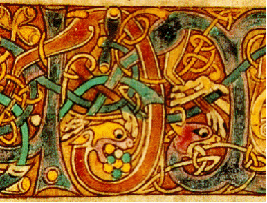
A page from the Book of KellsTo start with people had books or
scrolls. The Greeks had papyrus books or at least scrolls by 1000BC. The
dead sea scrolls written in ancient aramaic around the time of
the birth of Christ are simple text with no images. By 800AD some people
had books and the books sometimes had pictures in. If they had pictures
they were hand drawn or used techniques like wood cut printing, where
an engraved board is inked and pressed on to the page. Or the images were
handrawn and painted.
Text was rendered by hand (written) usually in Ink on parchment or vellum
(animal skin). In the latter part of this period monastaries started to
produce elaborate and decorative versions of the bible and other books from
Roman and Greek history. The books were usually in Latin and were often
copied by scribes from an original. This was a painstaking and time consuming
task so books were extremely valuable. Some libraries had chains on the
books to stop them being stolen. A bit like we somteimes do with laptops
now.
Perhaps the most famous example of these early bepoke books is the Book
of Kells a version of the four Gospels Which was created in 800AD
and is on display in the Library of Trinity College Dublin.
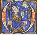
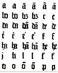
A medieval Drop Cap
Books of this period often have text and images interwoven
together typically using a Drop Cap, a large first letter of a sentence
often “illuminated” ie decorated and coloured, sometimes using
gold leaf. These methods of production worked well for a few thousand years
but writing and reading remained the preserve of the very few.
moveable type In the middle of the fifteenth century in western Europe
and incidently 450 years earlier in China, the way books were created changed
forever. Movable metal type was invented by Johannes Guttenburg.
This meant books could be mass produced for the first time.
Guttenburg's major work was a bible. The 42 line
or Guttenburg Bible. It is believed that 180 or so were
printed (mass production still meant surprisingly few). A copy of the bible
retailed for about 3 years average wages (not cheap either then).
Guttenburg's typefaceGuttenburgs first typeface was designed to look
like the writng you would get from a quill pen and so he reproduced a few
different versions of each letter.
Images were reproduced by engraving on copper plates and
he also invented a printing press whilst he was at it. That was it really.
The process didn't change much for 400 hundred years but there were a few
major stylistic improvements.
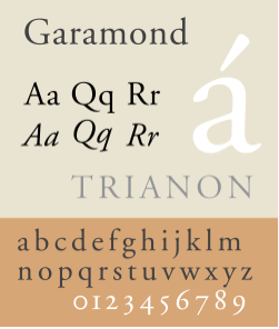
The Garamond Font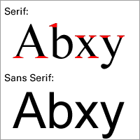 The earliest typefaces (fonts) after Guttenburg's
first go were often based on the Roman script found on stonework, all over
what had been the Roman Empire.
The earliest typefaces (fonts) after Guttenburg's
first go were often based on the Roman script found on stonework, all over
what had been the Roman Empire.
Claude Garamond Designed a wide range of
early fonts in the Sixteenth century said to have be inspired by monumental
masonary. It is reasonable to speculate that some of these early fonts look
the way they do because when you are using a chisel to hack at a lump of
rock the corners of letters tend to flair out a bit at the ends.
These serifs are charecteristic of early typefaces and
do incidentally aid readability. Serifed fonts are still used for longer
written work, the idea being that the serifs help the eye flow easily from,
one letter to the next and so are less tiring to read. I have never been
that convinced myself.
Times New Roman is probably still the most well known of
these types of font and is an example of the evolution of this type of typography.
Originally used by the Times newspapaper and released in 1933 it remains the
most used typeface on the planet as it is included with MS Word.
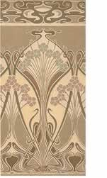
Liberty
WallpaperThe Arts and Craft Movement was a late
19th century movement which was partly a reaction to the mechanisation of
the Industrial Revolution. It was influential in terms of graphic design
although had little evloutionary influence on typography or imagery. Their
theory being one should look to nature and history for inspiration.
William Morris who is considered the movements leader in Europe went out
of his way to produce amongst much other work, books that looked like much
older woodcut manuscripts. Despite their look though they were typeset and
the images were produced using lithographs. He did however leave us with
the quote above and whilst I don't like his work its a great quote.
To some degree this celebration of adornement and a desire to escape the
oppresion of a mechanical age, can be said to still be the ruling aesthetic
in the UK and US. Morris's influence came to typify what is often now refered
to as Victorian Style even though it came at the end of
Victoria's reign. Elaborate wallpaper and repeating print are two other
of the Arts and Crafts movements legacies. The liberty paisley print
being a popular example.
The Arts and Crafts Movement were also inspired by the writings of John
Ruskin an early Socialist and it is interesting to see how they interpreted
the Socialist ideal compared to the Bauhaus who followed them.
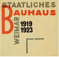
Early PosterThe Bauhaus movement
active in Weimar, Germany in the 1920's had as big an impact on typography
and design as Guttenburgs invention some 400 years before. In truth before
the Bauhaus thre was no "graphic design" just print layout. The
Bauhaus pretty much invented the idea of modernism and its director Ludwig
Mies van der Rohe is asociated forever with the phrase less is
more a quote inspired by a Robert Browning poem.
Predominently concerned with archeitectural design the Bauhaus also re-invented
the use of image and text.The Bauhaus's graphic design popularised the use
of san serif fonts which were used in unusual (at least at the time) ways.
They also promoted a paired down minimal aesthetic which embraced architecture,
furniture, design and graphic design.
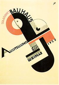
poster 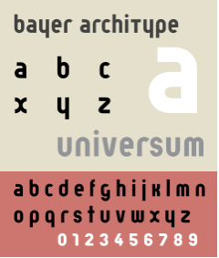
Bayer's Universal font For the Bauhaus pieces of text became elements
or graphics that needed as much thought about thier position
as images did. This seems obvious now but in 1920 it was a revelation.
The Bauhaus's leading typographer Herbert Bayers is responsible
for much of their Iconic work. In 1927 his Universal Typeface
mixed upper and lowercase lettering and with not a serif in sight conventions
were shattered. Not satisfied with mixing cases he standardised on a lowercase
typeface for many later Bauhaus publications. He went on to be art director
at German Vogue.
The Bauhaus's style was inspired by industry and by design was anti-adornment.
Further it was Socialist in its belief of what design could achieve. They
were interested in making products for everybody and were linked to the
Socialist revolution in Russia as well as ideas like Constructivism. Whilst
the Bauhaus were influential at the time it was to be a while before their
design ideas reached a mass market. In 1940 the Nazis effectively closed
down the Bauhaus and many of its lecturers fled to Europe and the US. They
took thier ideas with them and after the war these ideas did reach a wider
world. If the Bauhaus design ideal is alive and well today it is in IKEA
of all places.
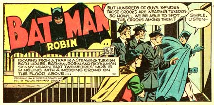
Early Batman comicAs the 1930's became the 1940's and the Bauhaus broke
up intellectually inspired graphic design lost its way rather. However something
"low brow" that had been bubbling under for a few years came to
the fore and filled the void. Pulp printing of cheap books and comics for
mass consumption at cheap prices.
Nowhere was this more popular than in the USA. Superheoes emerged and
as they had super powers they needed super illustrators with good graphics
skills to breath life into what were often fairly leaden plots.
Aimed at children initially but actually consumed by an audience that grew
up with the comics, they used interesting font layouts and often used the
shape of text to illustrate its meaning. Comics were seen at the time as
morally dubious but the genre survives today and the off- shoot the graphic
novel has had a resurgance. Works like Watchmen have sold
as well as any text based novel, The genre also has huge followings in the
Far East with Japanese Manga crossing over into western comic book design.
Comic book design is one of the last areas of graphic design where most
of the work including the lettering is still done by hand.
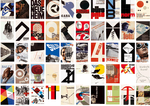
Some examples of swiss style
The next major event was a return to the formalism and paired down aesthetic
of the Bauhaus. Coming from the design houses of Zurich and Basel, it
bought the ideas of the Bauhaus to a mainstream mass audience. The so called
Swiss or International Style used realistic images, san serif fonts and
lots of white space to great effect
Much moden "design" is in the swiss style its hard to image how much
impact Helvetica, the Swiss styles font of choice has had . This site is
definately in the
swiss style as are much of the company logos and brands we all see all
the time. The Gap is Swiss style gone mad.
Max Miedinger invented
Helvetica in (1957) and from then on the world went for the Swiss style
in a big way. Magazines, posters and advertising all changed rapidly and
in lots of ways they have never changed back. Oddly some areas of life
notably archietecture and furniture design took rather longer to get swissed.
The swiss style is one of those things. You love it or you hate it.
Whilst not neccessarily mainstream or commercial, the Pop
Art movement of the late 1950's and 1960's influenced the way we
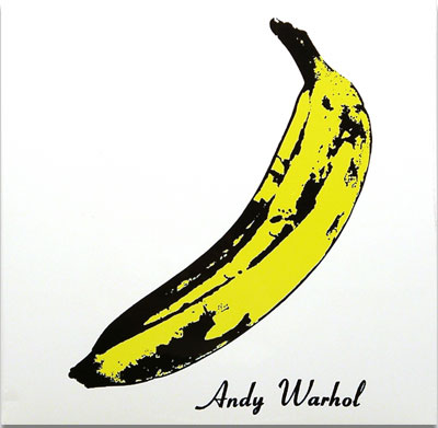
use and view graphic imagery. Andy Warhol's iconic album cover for the Velvet
Underground's first LP was influenced by his screen print works using primary
colours and the increasing amount of graphic design people were becoming
exposed to in everyday life.
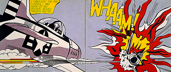 Roy
Lichtensteins work often took the superhero comic books of the
1930 and 40's as inspiration. Again vibrant colours and a creative use of
text made a big inpact.
Roy
Lichtensteins work often took the superhero comic books of the
1930 and 40's as inspiration. Again vibrant colours and a creative use of
text made a big inpact.
By championing the mundane Pop Art, took what may have been considered
low art or bad design and made it acceptable and "cool" amognst
the cogniscentii. Many people accused the Pop Artists of making bad art
but it seems to have stood the test of time pretty well.
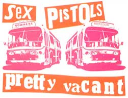
It seems important before I close this period of history to mention the
work of Jamie Reid who's graphic design style broke almost
all the conventions the Bauhaus had established when they themselves tore
up the rule book in the 1920's.
In his use of of layout and typogrpaphy links can be seen to Pop Art but
also a desrire to break with any real formalism and just let rip. What better
way to promote anarchy than by an aesthetic that is itself anarchistic and
deliberately provocative.
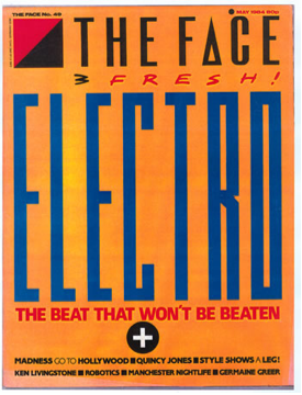
Neville Brody
Face cover
1980 is significant because about then the use of manual layout methods
of type and true cut and paste with scisssors and glue were abandoned, in
favour of computers and digital images. Packages like Quark Express and
Photoshop start to become the creative tools of choice from about this time
and prototyping and versioning become easier.
One of the most important and influential early masters of graphic design
in the computer age was Neville Brody. Brody pushed the
conventions of type to the limit with his ground breaking work in the late
1980's. On notably The Face magazine. He continues to plough
an innovative furrow today. His style is minimal but with a fluency the
Bauhuas could perhaps imagine but not execute, given the technical constraints
of the day.
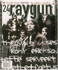
David Carson is again an influential graphic designer said to be responsible
for the Grunge Movement in graphics in the late 1990's.
Using a free, rough style that is influenced by the art of Keith
Harring and the graffitti art of Jean Michel Basquiat.
His work echoes Jamie Reids work in the 1970's but again the digital nature
of the execution means there is more oppurtunity to spend ages making something
that looks like it took no time at all.
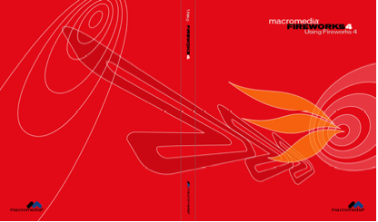
Neville Brody for MacromediaThe biggest innovation in the digital
era has been that type and imagery have become virtually interchangeable
on the page. Editing and imaging applications have meant that getting ideas
on to the page is easier than it was in the past. Conventions about what
can and cannot be done both within typography and design have become blurred
or just disregarded.
Today high quality graphics output is available to anybody who has the
skills and creativity. When the Bauhaus set out to make good design available
to everyone it seems unlikely they imagined a world where so much content
would be created and so much of it would be low quality. Having said that
the sheer volume of stuff created means there is more good work around than
ever.
David CarsonPerversly the sheer ease of producing work in the digital
age means that to capture someones attention you have to make something
a little different from the mainstream. It is hard to say who the graphic
design stars of the 21st century will be but somewhere, somebody is having
ideas about type and imagery and it seems likely that they will put these
ideas in to practice in a screen based format. I have yet to see a piece
of work on the web that I thought was as good as the best poster or book
cover I have ever seen. I wonder if I will still say tht in 10 years time.
I have picked a few of my heroes out here but many others designed fonts
or made software that made these peoples creativity possible. If art influenced
graphics to a great extent technology influenced it just as much. As good
graphics is so good you don't notice it much will always go un-noiticed.
Note the images on these pages are believed to be exempt from Copyright
as they represent fair use in Law. In that they are used to represent point
of view in an educational work.